Logos compilation
Almyra – A Seaside Identity
For Almyra Luxury Suites on Kantouni Beach in Kalymnos, I turned the initial “A” into a minimal fishbone symbol. The mark connects the name Almyra, which evokes the saltiness of the sea, with the suites’ setting on the Aegean.
Clean lines, open space within the symbol and a widely spaced wordmark echo the airy interiors and contemporary design of the suites. The result is a refined identity with a subtle reference to the sea.
Visit the Almyra Luxury Suites website, which I also designed.
Birdy on the Move
Birdy on the Move began with Billy, the founder’s African parrot. The first backpack carrier was made for Billy so he could come along on outings and trips. That idea grew into a business making backpack carriers for pet birds, giving owners more freedom to travel with their companions.
I took inspiration for the logo from Billy himself. The name captures the idea that started it all: wherever you’re going, your bird can come along.
Massa Ciao – A Texas-Inspired Identity for the Grill
Run by two brothers, Massa Ciao is a grill restaurant on the village square in Kontopouli, Lemnos. When the brothers introduced premium cuts to the menu, I created a new identity centred on the grill and the meat they cook.
The rebrand moves from a pirate-inspired identity to a visual language drawn from Southern steakhouse and Texas grill culture. Bold, angular buffalo horns anchor the new logo, giving it a rugged character that suits the restaurant’s focus on quality cuts.
Emotive Dogs – The Bond Behind the Training
Emotive Dogs trains Labradoodles as companion and support dogs, including for children with additional needs. I designed the logo around the bond between a dog and the person it supports, often a child. The figures lean into one another, while a warm orange circle frames the moment. The close pose and simple lines convey trust, reassurance and companionship.
Harder than Rock – Breaking the Rock
Harder than Rock was conceived as a streetwear headwear brand with bold designs and gold and diamond embellishments. I used a diamond-shaped outline to represent the rock and an angular “H” to break through it. The idea is that the “H” is harder than even the hardest stone. The lettering follows the same sharp geometry, and the mark was designed to work in black or metallic finishes, including as an embellishment on the headwear itself.
Marble Events – An Identity for Special Occasions
Created for a company organising weddings and high-end events in luxury hotels, the Marble Events identity takes a restrained, elegant approach. The initials “M” and “E” come together in an abstract geometric monogram, using a few precise strokes to create a sculptural form. Generous space and understated typography give the composition a composed presence, suited to celebrations where the setting and every detail matter.
Royal – A Crowning Detail
Created for Medicare Europe’s Royal range of food supplements and cosmetics, the identity gives the brand a refined, contemporary expression. A crown rests above the “O”, integrating the royal reference directly into the name. Slender geometric lettering balances this distinctive detail with simplicity. The wordmark provides a consistent foundation for both the Gold and Silver collections, with their respective packaging finishes defining each range’s positioning.
Dombus – Clarity and Structure
Designed for an accounting professional, the Dombus identity pairs a geometric emblem with a clean, carefully spaced wordmark. Angular forms and a central branching motif sit within a circle, giving the composition a sense of organisation and cohesion. The restrained black-and-white treatment supports a professional presence, connecting the visual identity with the clarity, method and attention to detail that accounting requires.
Sklavenitis Interior – Bringing Space into the Symbol
For a store specialising in furniture and home interiors, the identity connects the name with the spaces it helps shape. Angular black lines form an abstract “S”, recalling the walls and openings of a floor plan. A green lowercase “i” sits within this framework, bringing “interior” directly into the symbol. The interplay of letters and open space creates a clear connection to furnishing, planning and the home.
Konstantinidis – A Signature of Precision
For a long-established watch repair shop, the logo brings the family name and its specialist craft into a single symbol. The initial “K” forms the hands of a clock, surrounded by fine hour markers, while the slender vertical element recalls a watchmaker’s precision tool. Widely spaced lettering complements the detailed emblem, expressing the patience, accuracy and care associated with repairing timepieces.
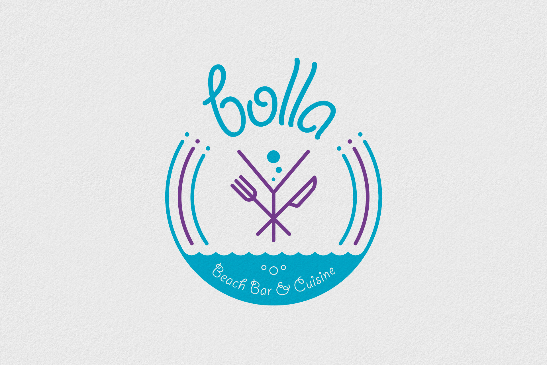
Bolla – Where Beach Life Meets the Table
Designed for a beach bar and restaurant, the identity combines food, cocktails and the sea in one playful composition. A cocktail glass, fork and knife meet at the centre, while bubbles and a rippling waterline introduce the seaside setting. Curved outlines, flowing lettering and a turquoise-and-purple palette capture the relaxed energy of a place where a day at the beach continues over drinks and a meal.
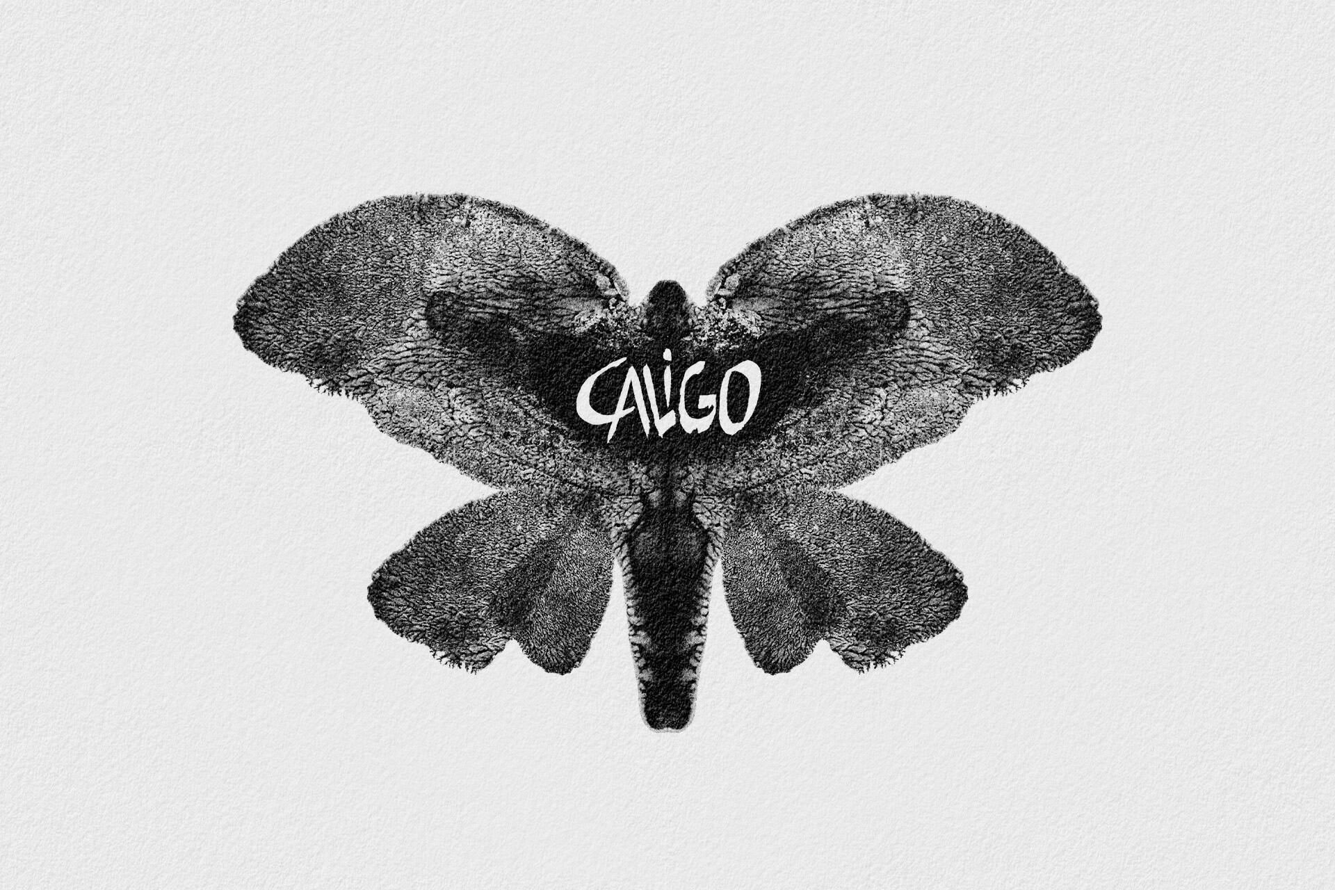
Caligo – A Distinctive Stage Presence
Taking its name from the Caligo butterfly, this identity gives a mainstream music band a distinctive visual signature. The butterfly becomes the central image, with textured wings and a symmetrical silhouette that also invite an elephant-like second reading. A white handwritten wordmark cuts through the dark form, adding spontaneity and contrast. The combination brings an organic, expressive character to the band’s name.
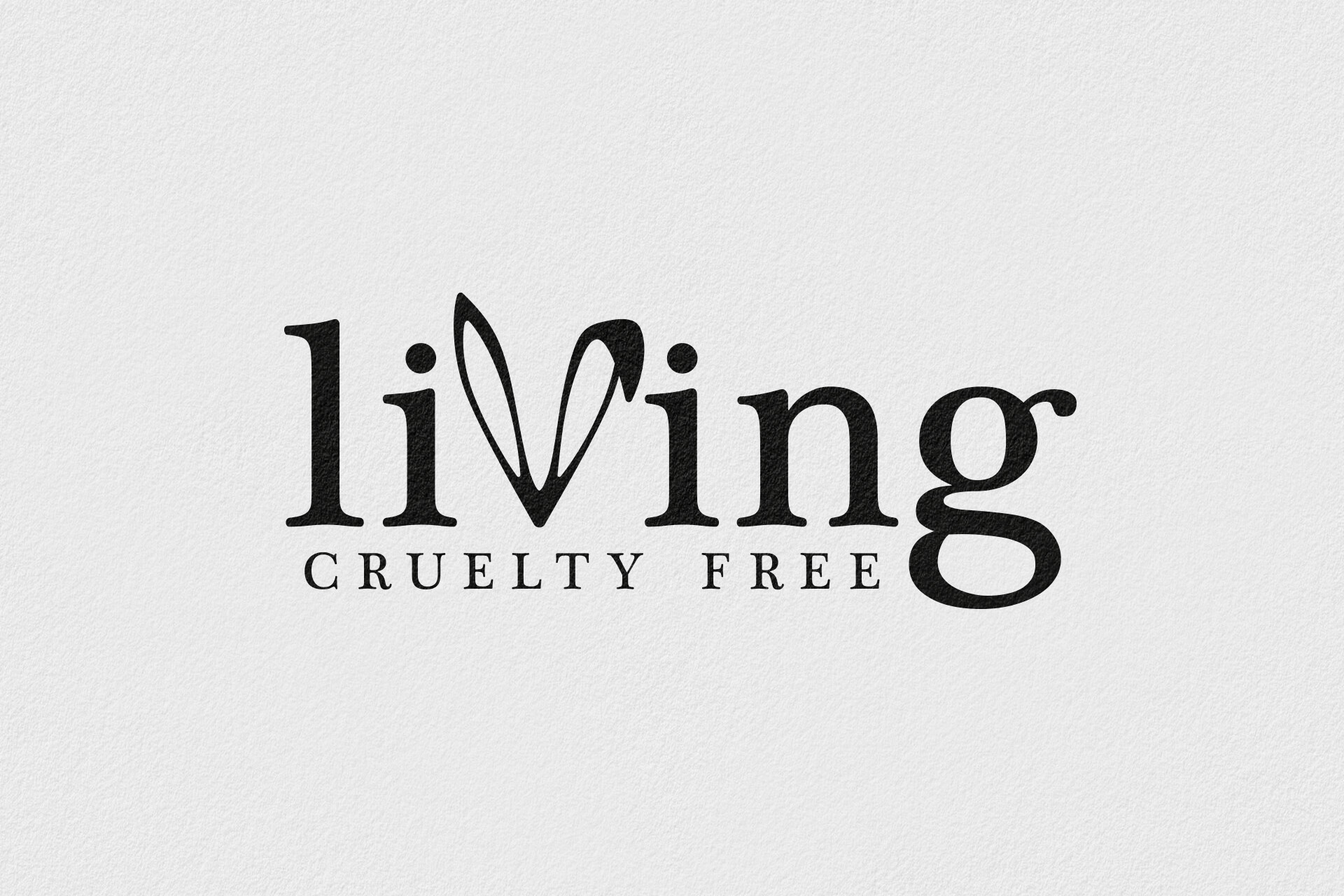
Living Cruelty Free – A Purpose Built into the Name
For a store dedicated to cruelty-free products, the logo makes its purpose part of the wordmark. The “v” in “living” becomes a pair of rabbit ears, introducing a recognisable reference to animal welfare within the name itself. Warm serif typography gives the identity an approachable, editorial character, while the clearly positioned “cruelty free” descriptor makes the store’s focus immediately understandable.
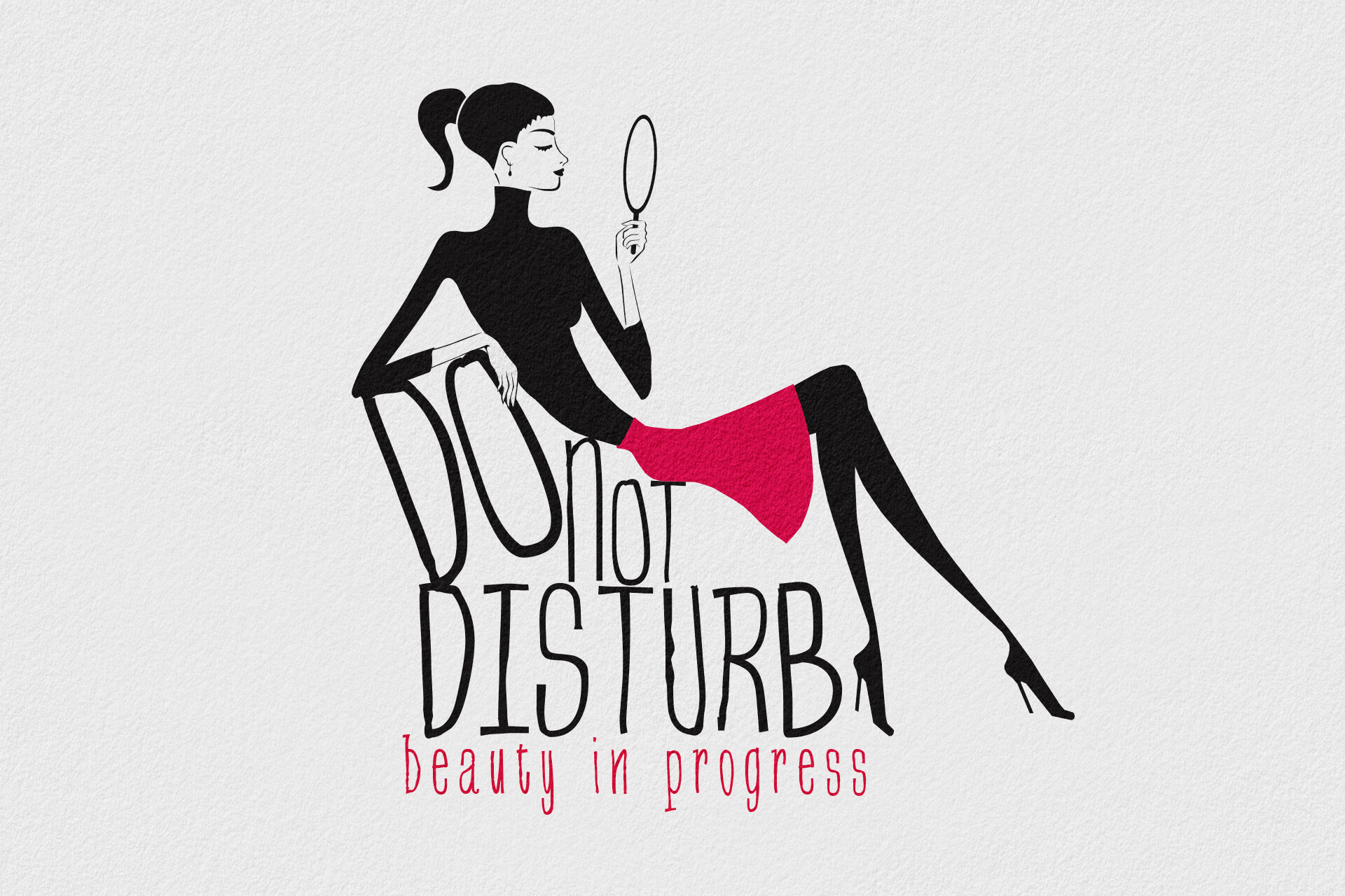
Do Not Disturb – Time for Yourself
For a beauty salon offering a complete approach to personal care and appearance, the identity turns a familiar phrase into an invitation to take time for yourself. A woman holding a mirror sits above lettering that becomes part of her chair, bringing illustration and typography into one composition. A vivid pink skirt punctuates the black silhouette, while “beauty in progress” completes the idea with a playful reference to the salon experience.
Yacht Supply – You are on holiday, we’ll do the shopping.
Yacht Supply delivers provisions directly to boats in marinas. I designed the logo around an origami boat, using folded paper to suggest both a boat and a shopping bag. Three shades of blue connect the mark to the sea and represent the three stages of the service: ordering, tracking and delivery.